Making sure you have the correct font choices is vital when making your opening title sequence. This is because the font if good will help create the right right atmosphere, and keep the audiences interested, however if you have a good OTS and the font doesn't match then it will ruin the eery atmosphere that you want for a horror OTS.
|
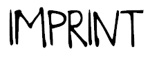
The font is called 'Brookes', it seems to have some scene of horror to it and i think could be used in a horror movie, however for our OTS, we were thinking of having something which fits more to our theme which is stalker, thats why the font we have chosen has a shadow behind it.
|
|
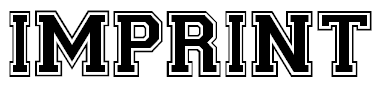
This font is called 'Collegiate Heavy', and looks like an American collage font. It stands out however, it would not suite a horror film and would ruin the atmosphere.
|
|
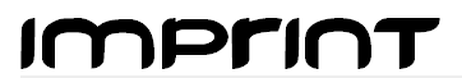
This font is called 'freedom'. It looks as if it would fit the genre of Sci-Fi, and would build the wrong atmosphere. It doesn't suite the gory, horrifying atmosphere i which we want to create. The font itself has soft edges, eliminating it from the horror genre.
|
For our OTS we choose a font which looks like the first example, we decided to go for a simple design which also fits the effect of the typewriter in which we were going for. We wanted to insure that it looked professional, by doing this we looked and tested different fonts and picked the one which fitted best with the music and images to set the right tone and atmosphere.
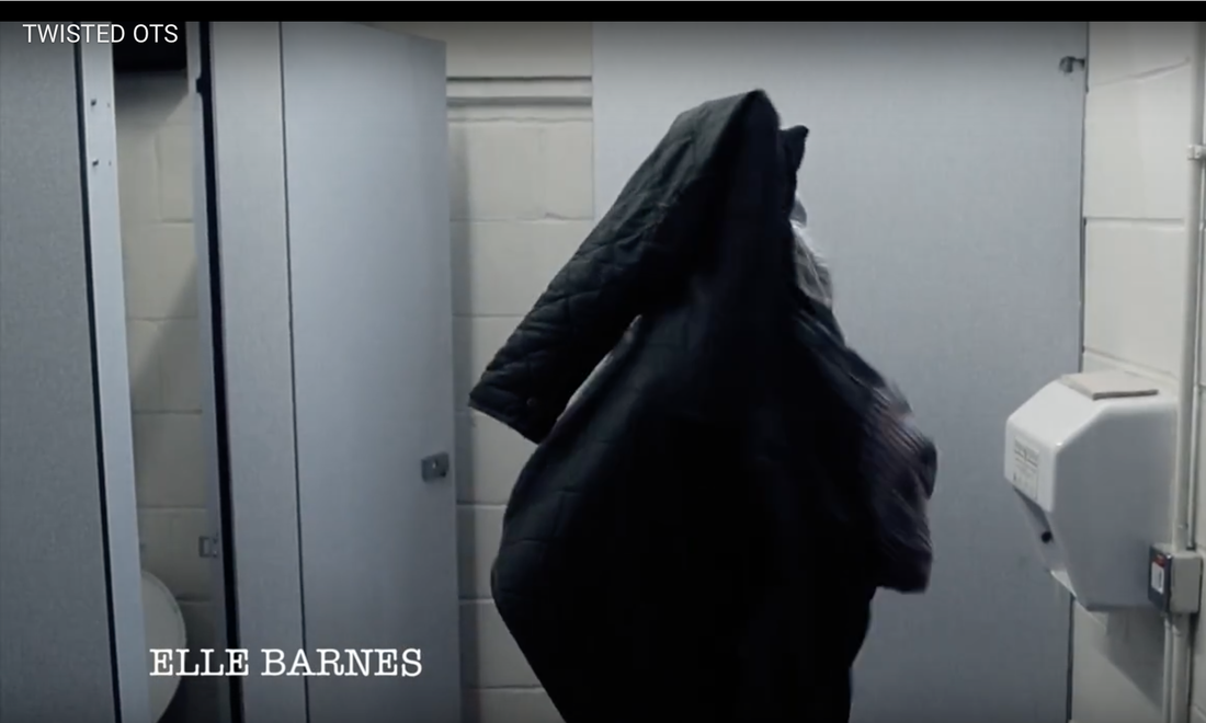
For our title we used a font that was on Final Cut. We choose this font because it fits best with out OTS. We tried many different fonts and picked the one best fitted. The 3D and shadowed effect sets a dark tone from the start which is what we were going for. It's on a non-distracting background so the focus is on the title which is what is important. There's also a fade of black in the corners of the page which also adds to the dark tones.
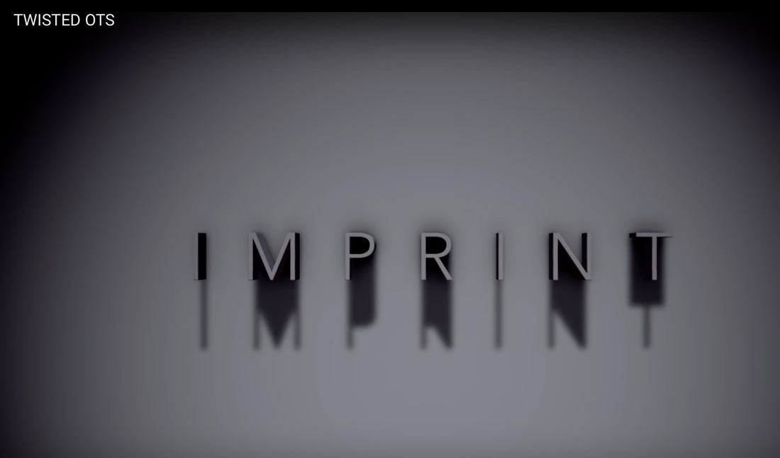
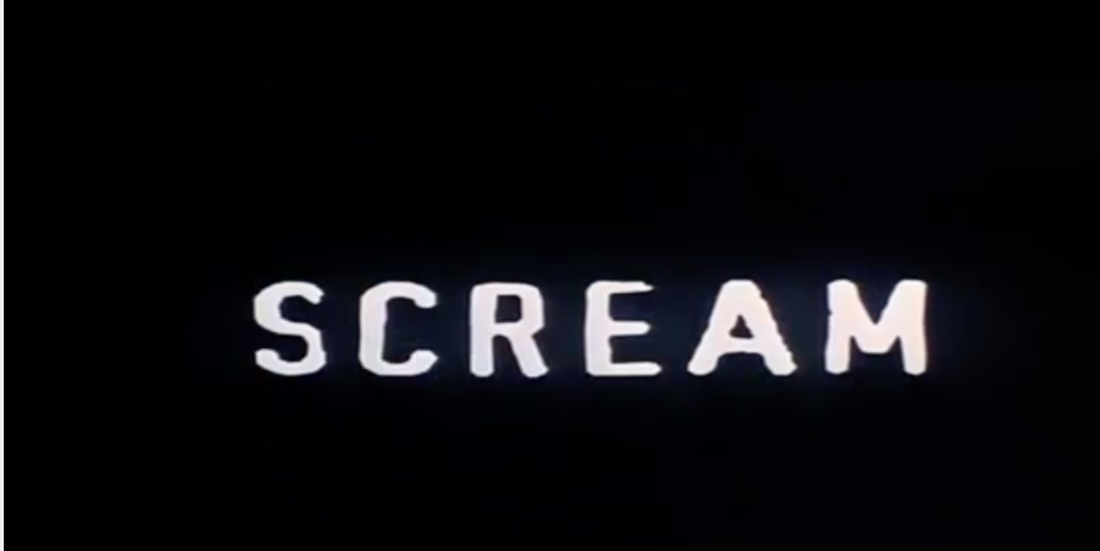
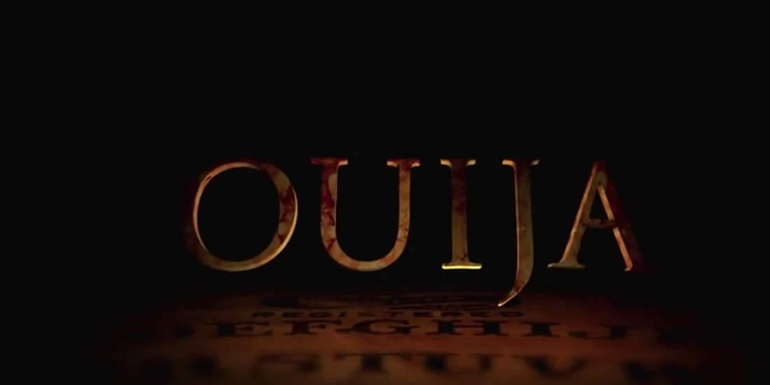
Our inspiration for our font was Scream, as it is too a simply design. It is based on a non-distracting background so all your focus is put onto the title. However the title itself isn't 3D effect so our inspiration for that is from Ouija, it's use of 3D gives the audience a sense of the film just from the title which is what we wanted to do.
|
|
